Preferences & Settings
Note
This topic discusses preferences and settings as it pertains to SmartApps. Information about device type preferences can be found in the Device Type Developer’s Guide
The preferences section of a SmartApp specifies what kinds of devices and other information is needed in order for the application to run. Inputs for each of these are presented to the user during installation of the SmartApp from the mobile UI. You can present all of these inputs on a single page, or break them up into multiple pages.
As usual, the best way to become comfortable with something is through trying it yourself. So, fire up the web IDE and try things out!
Preferences Overview
Preferences are made up of one or more pages, which contain one or more sections, which in turn contain one more elements. The general form of creating preferences looks like:
preferences {
    page() {
        section() {
            paragraph "some text"
            input "motionSensors", "capability.motionSensor",
                title: "Motions sensors?", multiple: true
        }
        section() {
            ...
        }
    }
    page() {
        ...
    }
}
All inputs from the user are stored in a read-only map called settings. You can access the value entered by the user by indexing into the map using the name as the key (settings.someName)
Page Definition
Pages can be defined a couple different ways:
page(String pageName, String pageTitle) {}
preferences {
    // page with name and title
    page("page name", "page title") {
        // sections go here
    }
}
page(options) {}
This form takes a comma-separated list of name-value arguments.
Note
this is a common Groovy pattern that allows for named arguments to be passed to a method. More info can be found here.
preferences {
    page(name: "pageName", title: "page title",
         nextPage: "nameOfSomeOtherPage", uninstall: true) {
        // sections go here
    }
}
The valid options are:
- name (required)
- String - Identifier for this page.
- title
- String - The display title of this page
- nextPage
- String - Used on multi-page preferences only. Should be the name of the page to navigate to next.
- install
- Boolean - Set to
trueto allow the user to install this app from this page. Defaults tofalse. Not necessary for single-page preferences. - uninstall
- Boolean - Set to
trueto allow the user to uninstall from this page. Defaults to false. Not necessary for single-page preferences.
We will see more in-depth examples of pages in the following sections.
Section Definition
Pages can have one or more sections. Think of sections as way to group the input you want to gather from the user.
Sections can be created in a few different ways:
section{}
preferences {
    // section with no title
    section {
        // elements go here
    }
}
section(String sectionTitle){}
preferences {
    // section with title
    section("section title") {
        // elements go here
    }
}
section(options, String sectionTitle) {}
preferences {
    // section will not display in IDE
    section(mobileOnly: true, "section title")
}
The valid options are:
- hideable
- Boolean - Pass
trueto allow the section to be collapsed. Defaults tofalse. - hidden
- Boolean - Pass
trueto specify the section is collapsed by default. Used in conjunction withhideable. Defaults tofalse. - mobileOnly
- Boolean - Pass
trueto suppress this section from the IDE simulator. Defaults tofalse.
Single Preferences Page
A single page preferences declaration is composed of one or more section elements, which in turn contain one or more elements. Note that there is no page defined in the example below. When creating a single-page preferences app, there’s no need to define the page explicitly - it’s implied. Here’s an example:
preferences {
    section("When activity on any of these sensors") {

        input "contactSensors", "capability.contactSensor",
            title: "Open/close sensors", multiple: true

        input "motionSensors", "capability.motionSensor",
            title: "Motion sensors?", multiple: true
    }
    section("Turn on these lights") {
        input "switches", "capability.switch", multiple: true
    }
}
Which would be rendered in the mobile app UI as:
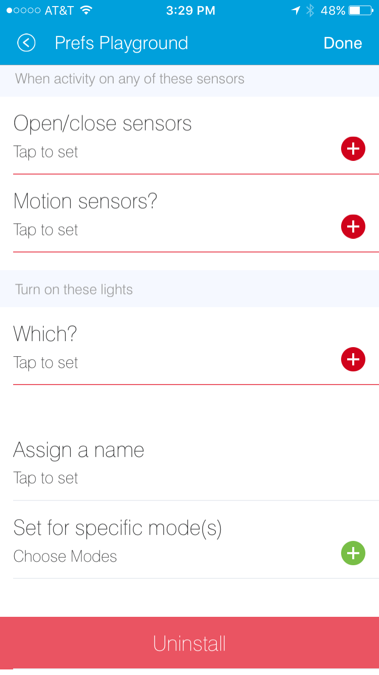
Note that in the above example, we did not specify the name or mode input, yet they appeared on our preferences page.
When defining single-page preferences, name and mode are automatically added. Also note that inputs that are marked as required: true are displayed differently by the mobile application, so that the user knows they are required. The mobile application will prevent the user from going to the next page or installing the SmartApp without entering required inputs.
Multiple Preferences Pages
Preferences can also be broken up into multiple pages. Each page must contain one or more section elements. Each page specifies a name property that is referenced by the nextPage property. The nextPage property is used to define the flow of the pages. Unlike single page preferences, the app name and mode control fields are not automatically added, and must be specified on the desired page or pages.
Here’s an example that defines three pages:
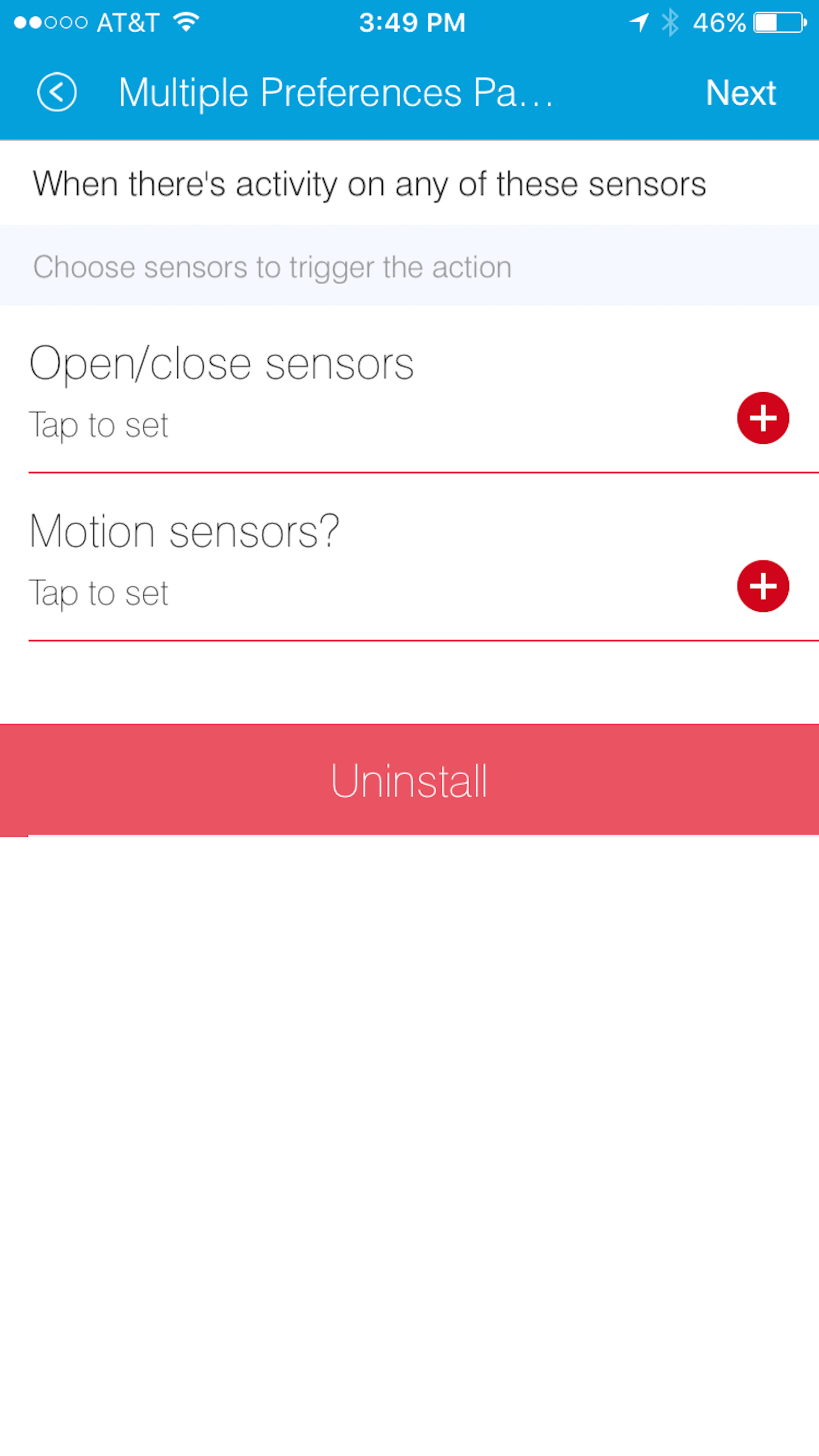
preferences {
page(name: "pageOne", title: "When there's activity on any of these sensors", nextPage: "pageTwo", uninstall: true) {
section("Choose sensors to trigger the action") {
input "contactSensors", "capability.contactSensor",
title: "Open/close sensors", multiple: true
input "motionSensors", "capability.motionSensor",
title: "Motion sensors?", multiple: true
}
}
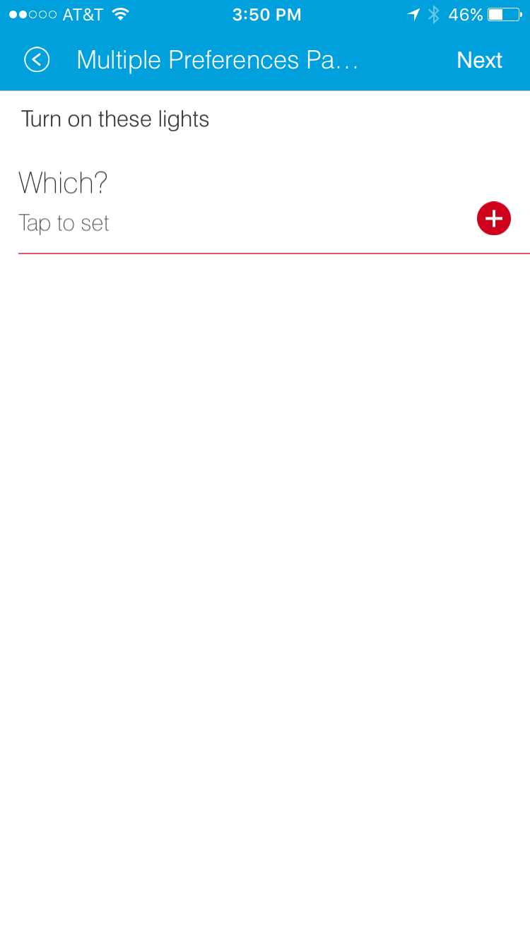
page(name: "pageTwo", title: "Turn on these lights", nextPage: "pageThree") {
section {
input "switches", "capability.switch", multiple: true
}
}
page(name: "pageThree", title: "Name app and configure modes", install: true, uninstall: true) {
section([mobileOnly:true]) {
label title: "Assign a name", required: false
mode title: "Set for specific mode(s)", required: false
}
}
}
The resulting pages in the mobile app would show the name and mode control fields only on the third page, and the uninstall button on the first and third pages:
| Page 1 | Page 2 | Page 3 |
|---|---|---|
|
|
|
Preference Elements & Inputs
Preference pages (single or multiple) are composed of one or more sections, each of which contains one or more of the following elements:
paragraph
Text that’s displayed on the page for messaging and instructional purposes.
Example:
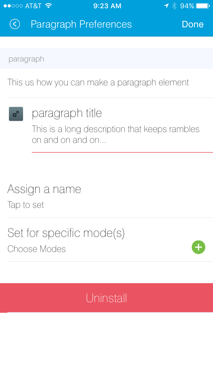
preferences {
    section("paragraph") {
        paragraph "This us how you can make a paragraph element"
        paragraph image: "https://s3.amazonaws.com/smartapp-icons/Convenience/Cat-Convenience.png",
                  title: "paragraph title",
                  required: true,
                  "This is a long description that rambles on and on and on..."
    }
}
The above preferences definition would render as:
Valid options:
- title
- String - The title of the paragraph
- image
- String - URL of image to use, if desired
- required
- Boolean -
trueorfalseto specify this input is required. Defaults tofalse.
icon
Allows the user to select an icon to be used when displaying the app in the mobile UI
Example:
preferences {
    section("paragraph") {
        icon(title: "required:true",
             required: true)
    }
}
The above preferences definition would render as:
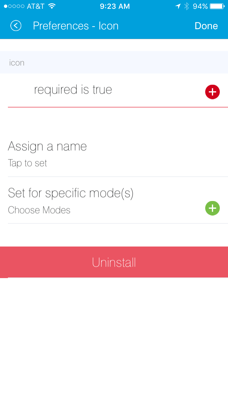
Tapping the element would then allow the user to choose an icon:
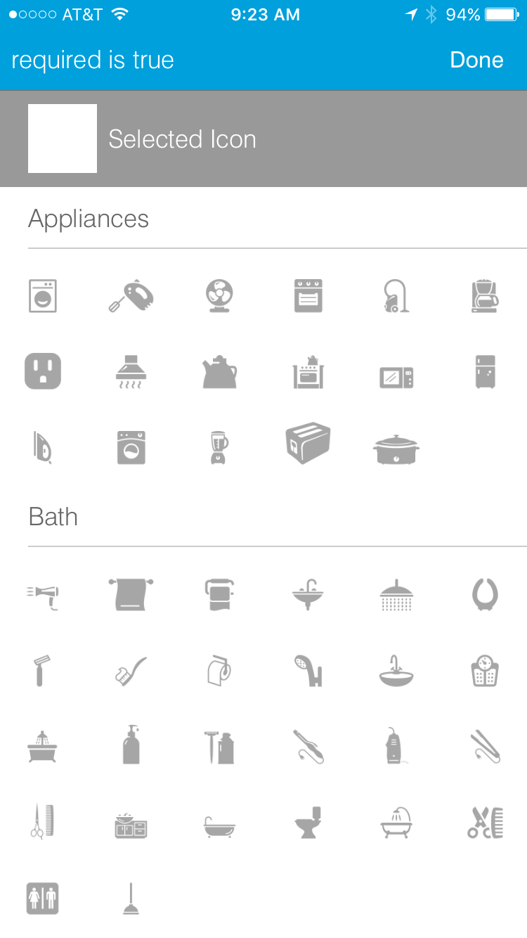
Valid options:
- title
- String - The title of the icon
- required
- Boolean -
trueorfalseto specify this input is required. Defaults tofalse.
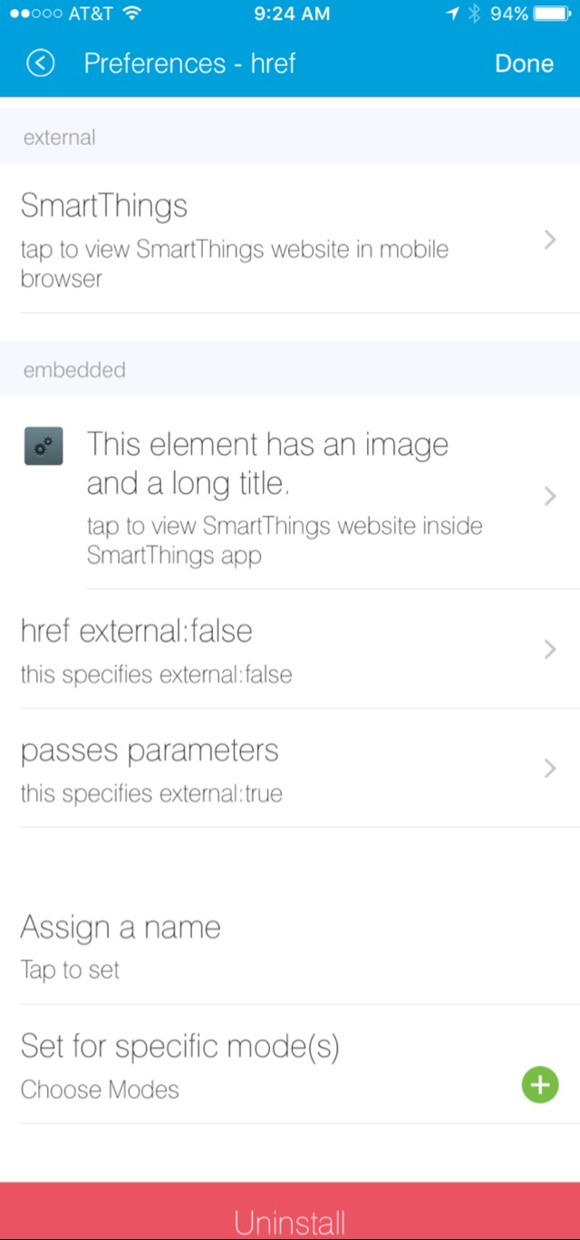
href
A control that selects another preference page or external HTML page.
Example of using href to visit a URL:
preferences {
    section("external") {
        href(name: "hrefNotRequired",
             title: "SmartThings",
             required: false,
             style: "external",
             url: "http://smartthings.com/",
             description: "tap to view SmartThings website in mobile browser")
    }
    section("embedded") {
        href(name: "hrefWithImage", title: "This element has an image and a long title.",
             description: "tap to view SmartThings website inside SmartThings app",
             required: false,
             image: "https://s3.amazonaws.com/smartapp-icons/Convenience/Cat-Convenience.png",
             url: "http://smartthings.com/")
    }
}
The above preferences would render as:
Example of using href to link to another preference page (dynamic pages are discussed later in this section):
preferences {
    page(name: "hrefPage")
    page(name: "deadEnd")
}

def hrefPage() {
    dynamicPage(name: "hrefPage", title: "href example page", uninstall: true) {
        section("page") {
            href(name: "href",
                 title: "dead end page",
                 required: false,
                 page: "deadEnd")
        }
    }
}

def deadEnd() {
    dynamicPage(name: "deadEnd", title: "dead end page") {
        section("dead end") {
            paragraph "this is a simple paragraph element."
        }
    }
}
You can use the params option to pass data to dynamic pages:
preferences {
    page(name: "firstPage")
    page(name: "secondPage")
}

def firstPage() {
    def hrefParams = [
        foo: "bar",
        someKey: "someVal"
    ]

    dynamicPage(name: "firstPage", uninstall: true) {
        section {
            href(name: "toSecondPage",
                 page: "secondPage",
                 params: hrefParams,
                 description: "includes params: ${hrefParams}")
        }
    }
}

// page def must include a parameter for the params map!
def secondPage(params) {
    log.debug "params: ${params}"
    dynamicPage(name: "secondPage", uninstall: true, install: true) {
        section {
            paragraph "params.foo = ${params?.foo}"
        }
    }
}
Valid options:
- title
- String - the title of the element
- required
- Boolean -
trueorfalseto specify this input is required. Defaults tofalse. - description
- String - the secondary text of the element
- external (deprecated - use style instead)
- Boolean -
trueto open URL in mobile browser application,falseto open URL within the SmartThings app. Defaults tofalse - style
String - Controls how the link will be handled. Specify “external” to launch the link in the mobile device’s browser. Specify “embedded” to launch the link within the SmartThings mobile application. Specify “page” to indicate this is a preferences page.
If
styleis not specified, butpageis, thenstyle:"page"is assumed. Ifstyleis not specified, buturlis, thenstyle:"embedded"is assumed.Currently, Android does not support the “external” style option.
- url
- String - The URL of the page to visit. You can use query parameters to pass additional information to the URL (For example, http://someurl.com?param1=value1¶m2=value1)
- params
- Map - Use this to pass parameters to other preference pages. If doing this, make sure your page definition method accepts a single parameter (that will be this params map). See the page-params-by-href example at the end of this document for more information.
- page
- String - Used to link to another preferences page. Not compatible with the external option.
- image
- String - URL of an image to use, if desired.
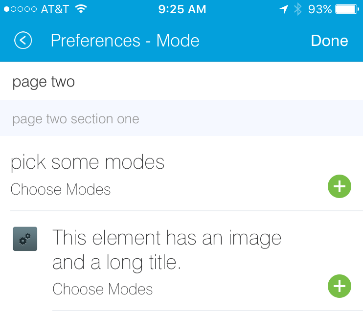
mode
Allows the user to select which modes the app executes in. Automatically generated by single-page preferences.
Example:
preferences {
    page(name: "pageOne", title: "page one", nextPage: "pageTwo", uninstall: true) {
        section("section one") {
            paragraph "just some text"
        }
    }
    page(name: "pageTwo", title: "page two") {
        section("page two section one") {
            mode(name: "modeMultiple",
                 title: "pick some modes",
                 required: false)
            mode(name: "modeWithImage",
                 title: "This element has an image and a long title.",
                 required: false,
                 multiple: false,
                 image: "https://s3.amazonaws.com/smartapp-icons/Convenience/Cat-Convenience.png")
        }
    }
}
The second page of the above example would render as:
Valid options:
- title
- String - the title of the mode field
- required
- Boolean -
trueorfalseto specify this input is required. Defaults tofalse. - multiple
- Boolean -
trueorfalseto specify this input allows selection of multiple values. Defaults totrue. - image
- String - URL of an image to use, if desired.
Note
There are a couple of different ways to use modes that are worth pointing out. The first way is to use modes as a type of enum input like this:
input "modes", "mode", title: "only when mode is", multiple: true, required: false
This method will automatically list the defined modes as the options. Keep in mind when using modes in this way that the modes are just data and can be accessed in the SmartApp as such. This does not effect SmartApp execution. In this scenario, it is up to the SmartApp itself to react to the mode changes.
The second example actually controls whether the app is executed based on the modes selected:
mode(title: "set for specific mode(s)")
Both of these methods of using modes are valid. The impact on SmartApp execution is different in each scenario and it is up to the SmartApp developer to properly label whichever form is used and code the app accordingly.
label
Allows the user to name the app installation. Automatically generated by single-page preferences.
Example:
preferences {
    section("labels") {
        label(name: "label",
              title: "required:false",
              required: false,
              multiple: false)
        label(name: "labelRequired",
              title: "required:true",
              required: true,
              multiple: false)
        label(name: "labelWithImage",
              title: "This element has an image and a title.",
              description: "image and a title",
              required: false,
              image: "https://s3.amazonaws.com/smartapp-icons/Convenience/Cat-Convenience.png")
    }
}
The above preferences definition would render as:
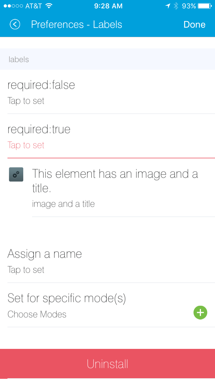
Valid options:
- title
- String - the title of the label field
- description
- String - the default text in the input field
- required
- Boolean -
trueorfalseto specify this input is required. Defaults tofalse. Defaults totrue. - image
- String - URL to an image to use, if desired
app
Provides user-initiated installation of child apps. Typically used in dashbard solution SmartApps, which are currently not supported for community development.
input
Allows the user to select devices or enter values to be used during execution of the smart app.
Inputs are the most commonly used preference elements. They can be used to prompt the user to select devices that provide a certain capability, devices of a specific type, or constants of various kinds. Input element method calls take two forms. The “shorthand” form passes in the name and type unnamed as the required first two parameters, and any other arguments as named options:
preferences {
    section("section title") {
        // name is "temperature1", type is "number"
        input "temperature1", "number", title: "Temperature"
    }
}
The second form explicitly specifies the name of each argument:
preferences {
    section("section title") {
        input(name: "color", type: "enum", title: "Color", options: ["Red","Green","Blue","Yellow"])
    }
}
Valid input options:
- name
- String - name of variable that will be created in this SmartApp to reference this input
- title
- String - title text of this element.
- description
- String - default value of the input element
- multiple
- Boolean -
trueto allow multiple values orfalseto allow only one value. Not valid for all input types. - required
- Boolean -
trueto require the selection of a device for this input orfalseto not require selection. - submitOnChange
- Boolean -
trueto force a page refresh after input selection orfalseto not refresh the page. This is useful when creating a dynamic input page. - options
- List - used in conjunction with the enum input type to specify the values the user can choose from. Example:
options: ["choice 1", "choice 2", "choice 3"] - type
String - one of the names from the following table:
Name Comment cacapability.capabilityName Prompts for all the devices that match the specified capability.
See the Preferences Reference column of the Capabilities Reference table for possible values.
device.deviceTypeName Prompts for all devices of the specified type. bool A trueorfalsevalue (value returned as a boolean).boolean A "true"or"false"value (value returned as a string). It’s recommended that you use the “bool” input instead, since the simulator and mobile support for this type may not be consistent, and using “bool” will return you a boolean (instead of a string). The “boolean” input type may be removed in the near future.decimal A floating point number, i.e. one that can contain a decimal point email An email address enum One of a set of possible values. Use the options element to define the possible values. hub Prompts for the selection of a hub icon Prompts for the selection of an icon image number An integer number, i.e. one without decimal point password A password string. The value is obscured in the UI and encrypted before storage phone A phone number time A time of day. The value will be stored as a string in the Java SimpleDateFormat (e.g., “2015-01-09T15:50:32.000-0600”) text A text value
Dynamic Preferences
One of the most powerful features of multi-page preferences is the ability to dynamically generate the content of a page based on previous selections or external inputs, such as the data elements returned from a web services call. The following example shows how to create a two-page preferences SmartApp where the content of the second page depends on the selections made on the first page.
 preferences {
    page(name: "page1", title: "Select sensor and actuator types", nextPage: "page2", uninstall: true) {
        section {
            input("sensorType", "enum", options: [
                "contactSensor":"Open/Closed Sensor",
                "motionSensor":"Motion Sensor",
                "switch": "Switch",
                "moistureSensor": "Moisture Sensor"])

            input("actuatorType", "enum", options: [
                "switch": "Light or Switch",
                "lock": "Lock"]
            )
        }
    }

    page(name: "page2", title: "Select devices and action", install: true, uninstall: true)

}

def page2() {
    dynamicPage(name: "page2") {
        section {
            input(name: "sensor", type: "capability.$sensorType", title: "If the $sensorType device")
            input(name: "action", type: "enum", title: "is", options: attributeValues(sensorType))
        }
        section {
            input(name: "actuator", type: "capability.$actuatorType", title: "Set the $actuatorType")
            input(name: "action", type: "enum", title: "to", options: actions(actuatorType))
         }

    }
}

private attributeValues(attributeName) {
    switch(attributeName) {
        case "switch":
            return ["on","off"]
        case "contactSensor":
            return ["open","closed"]
        case "motionSensor":
            return ["active","inactive"]
        case "moistureSensor":
            return ["wet","dry"]
        default:
            return ["UNDEFINED"]
    }
}

private actions(attributeName) {
    switch(attributeName) {
        case "switch":
            return ["on","off"]
        case "lock":
            return ["lock","unlock"]
        default:
            return ["UNDEFINED"]
    }
}
The previous example shows how you can achieve dynamic behavior between pages. With the submitOnChange input attribute
you can also have dynamic behavior in a single page.
preferences {
    page(name: "examplePage")
}

def examplePage() {
    dynamicPage(name: "examplePage", title: "", install: true, uninstall: true) {

        section {
            input(name: "dimmers", type: "capability.switchLevel", title: "Dimmers",
                  description: null, multiple: true, required: false, submitOnChange: true)
        }

        if (dimmers) {
            // Do something here like update a message on the screen,
            // or introduce more inputs. submitOnChange will refresh
            // the page and allow the user to see the changes immediately.
            // For example, you could prompt for the level of the dimmers
            // if dimmers have been selected:

            section {
                input(name: "dimmerLevel", type: "number", title: "Level to dim lights to...", required: true)
            }
        }
    }
}
Note
When a submitOnChange input is changed, the whole page will be saved. Then a refresh is triggered with the saved page state. This means that all of the methods will execute each time you change a submitOnChange input.
Examples
page-params-by-href.groovy shows how to pass parameters to dynamic pages using the href element.
Almost every SmartApp makes use of preferences to some degree. You can browse them in the IDE under the “Browse SmartApp Templates” menu.