Tiles
Tiles define how devices are represented in the SmartThings mobile application. There are currently two main areas where devices are viewed.
Note
Be sure to check out multiAttributeTile() below for new tile layout options.
The Things view is where you can see all of your devices listed.
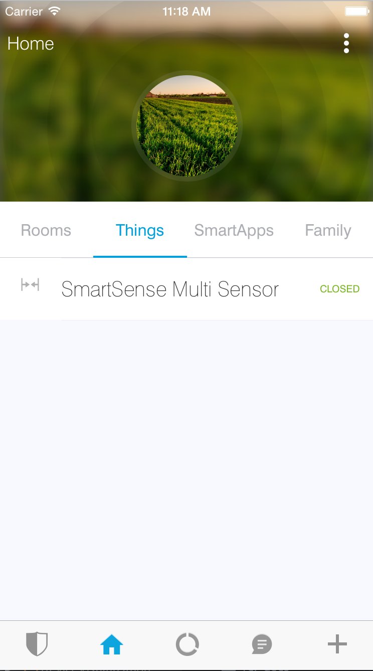
When tapping on one of the devices in the Things view, you will be presented with the Details view for the device.
When creating a Device Handler, you define how it will appear for the user on their Details screen by defining and configuring different Tiles.
Tiles are defined inside the metadata block of device handlers. Let’s take a look at how we can define Tiles in our device handlers.
Overview
Developers have control over the look and feel of the Details view by defining Tiles.
Tiles are defined in the Device Handler by calling the tiles() method. The tiles() method is composed of tile definitions, and layout information (the main and details method). There are five types of tiles that you can use within your Device Handler. Each tile serves a different purpose.
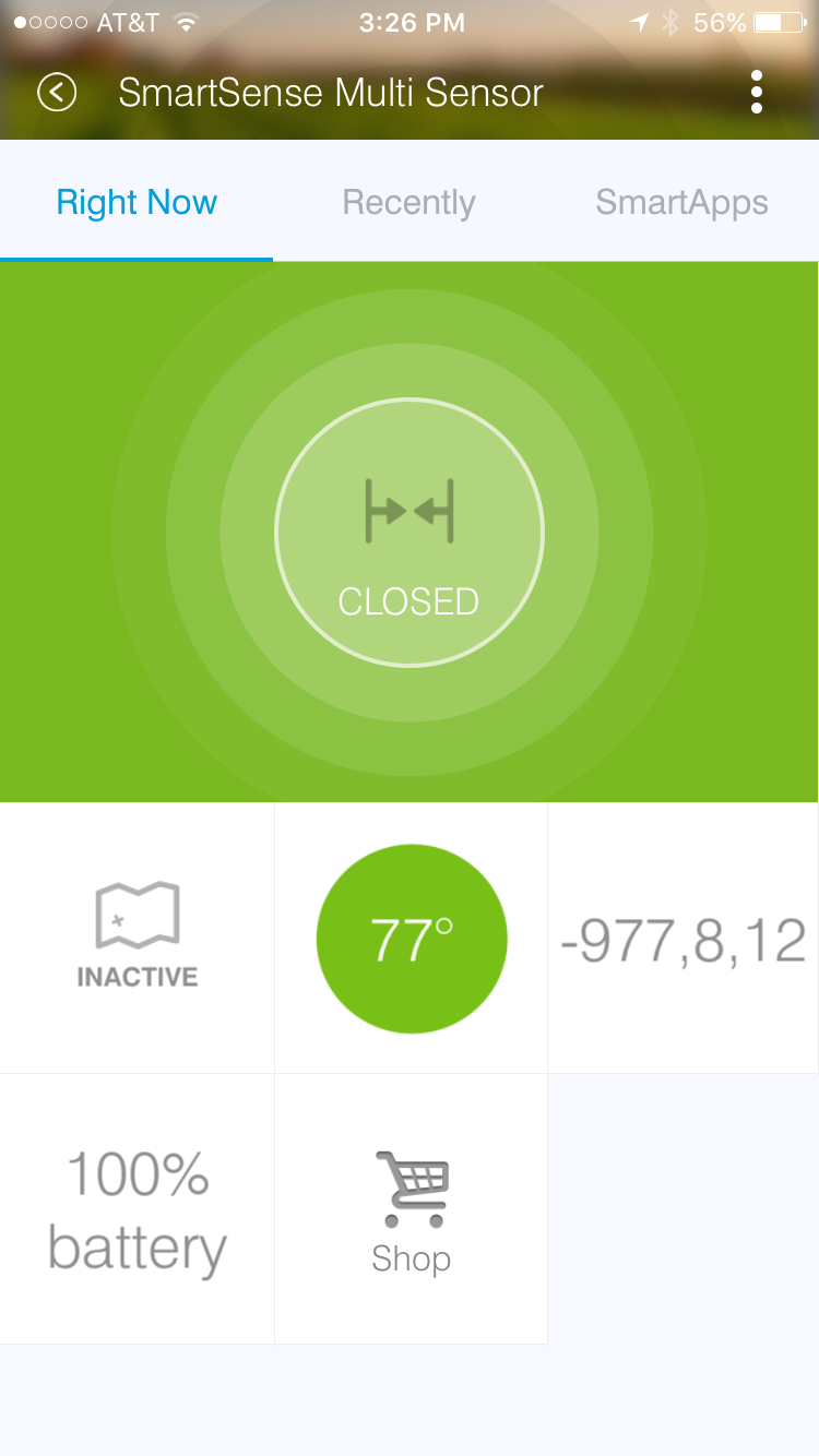
Consider this tiles block for the Multipurpose Sensor from the screenshot above:
tiles(scale: 2) {
    multiAttributeTile(name:"status", type: "generic", width: 6, height: 4){
        tileAttribute ("device.status", key: "PRIMARY_CONTROL") {
            attributeState "open", label:'${name}', icon:"st.contact.contact.open", backgroundColor:"#ffa81e"
            attributeState "closed", label:'${name}', icon:"st.contact.contact.closed", backgroundColor:"#79b821"
            attributeState "garage-open", label:'Open', icon:"st.doors.garage.garage-open", backgroundColor:"#ffa81e"
            attributeState "garage-closed", label:'Closed', icon:"st.doors.garage.garage-closed", backgroundColor:"#79b821"
        }
    }
    standardTile("contact", "device.contact", width: 2, height: 2) {
        state("open", label:'${name}', icon:"st.contact.contact.open", backgroundColor:"#ffa81e")
        state("closed", label:'${name}', icon:"st.contact.contact.closed", backgroundColor:"#79b821")
    }
    standardTile("acceleration", "device.acceleration", width: 2, height: 2) {
        state("active", label:'${name}', icon:"st.motion.acceleration.active", backgroundColor:"#53a7c0")
        state("inactive", label:'${name}', icon:"st.motion.acceleration.inactive", backgroundColor:"#ffffff")
    }
    valueTile("temperature", "device.temperature", width: 2, height: 2) {
        state("temperature", label:'${currentValue}°',
            backgroundColors:[
                [value: 31, color: "#153591"],
                [value: 44, color: "#1e9cbb"],
                [value: 59, color: "#90d2a7"],
                [value: 74, color: "#44b621"],
                [value: 84, color: "#f1d801"],
                [value: 95, color: "#d04e00"],
                [value: 96, color: "#bc2323"]
            ]
        )
    }
    valueTile("3axis", "device.threeAxis", decoration: "flat", wordWrap: false, width: 2, height: 2) {
        state("threeAxis", label:'${currentValue}', unit:"", backgroundColor:"#ffffff")
    }
    valueTile("battery", "device.battery", decoration: "flat", inactiveLabel: false, width: 2, height: 2) {
        state "battery", label:'${currentValue}% battery', unit:""
    }
    standardTile("refresh", "device.refresh", inactiveLabel: false, decoration: "flat", width: 2, height: 2) {
        state "default", action:"refresh.refresh", icon:"st.secondary.refresh"
    }

    main(["status", "acceleration", "temperature"])
    details(["status", "acceleration", "temperature", "3axis", "battery", "refresh"])
}
Tiles are defined with either a scale: 1 (default) or scale: 2 argument. The value of 2 will enable the 6 X Unlimited grid layout. If the scale argument is not supplied, it will be set to the default value of 1.
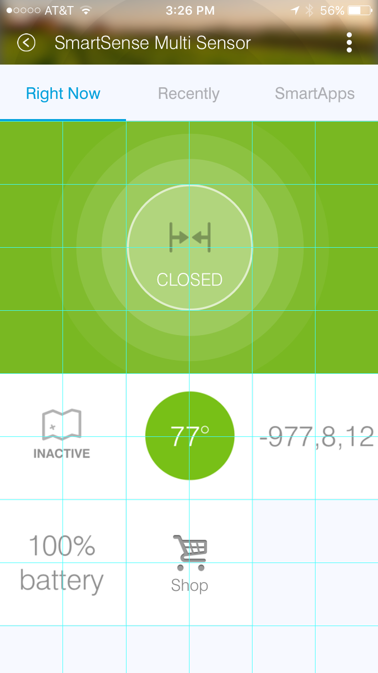
Here you can see how the tiles defined above are laid out using the 6 X Unlimited grid (using the scale: 2 option):
Note
The grid layout can be a 3 column, unlimited row, grid system or a 6 X Unlimited grid to be more visually appealing and to give developers more flexibility when defining layouts. New 6 X Unlimited tiles will be scaled back on older versions of the SmartThings mobile app that do not support the 6 X Unlimited grid layout.
The first argument to the tile methods (standardTile(), valueTile(), etc.) is the name of the tile. This is used to identify the tile when specifying the tile layout.
The second argument is the attribute this tile is associated with. Each tile is associated with an attribute of the device.
In the example above, a standardTile() (more on that later) is created with the name "contact", for the “contact” attribute. The convention is to prefix the attribute name with "device" - so the format is "device.<attributeName>".
The contact attribute has two possible values: “open”, and “closed”. Since we want the display to change depending on if the contact is open or closed, we define a state for each. The state() method allows us to specify display information like icon and background color for each state, as well as specify what action should happen when the tile is interacted with in its current state.
The state() method is discussed later in this document.
Common Tile Parameters
All tiles support the following parameters:
- width
- number - controls how wide this tile is. Default is 1.
- height
- number - controls how tall this tile tile is. Default is 1.
- canChangeIcon
- boolean -
trueto allow the user to pick their own icon. Defaults tofalse. - canChangeBackground
- boolean -
trueto allow a user to choose their own background image for the tile. Defaults tofalse. - decoration
- String - specify “flat” for the tile to render without a ring.
Note
You may see Device Handlers that use the inactiveLabel property. This is deprecated and has no effect.
State
Each tile can have one or more state() definitions.
Let’s consider a switch tile definition example:
standardTile("switchTile", "device.switch", width: 2, height: 2,
             canChangeIcon: true) {
    state "off", label: '${name}', action: "switch.on",
          icon: "st.switches.switch.off", backgroundColor: "#ffffff"
    state "on", label: '${name}', action: "switch.off",
          icon: "st.switches.switch.on", backgroundColor: "#E60000"
}
Important
Notice anything strange about the label value for state? It appears to be using Groovy’s string interpolation syntax (${}), but with a single quote. In Groovy, String interpolation is only possible for strings defined in double quotes. So, what gives?
When the SmartThings platform executes the tiles() method you have defined, it doesn’t yet know anything about the actual devices. Only later, when the device details screen is rendered in the mobile client, does the platform know information about the specific devices.
So, we use single quotes for the label (${name}) because the platform can then manually substitute the actual value later, when it is available.
Long story short - the above is not a typo. Use single quotes for interpolated string values in the tiles definition.
The “switch” attribute specifies two possible values - “on” and “off”. We define a state for each possible value. The first argument to the state() method should be the value of the attribute this state applies to (there is an exception to this rule discussed below).
When the switch is off, and the user presses on the tile on their mobile device, we want to turn the switch on. We specify this action using the action parameter.
The value of the action parameter should be the name of the command to invoke. The convention is to prefix the command name with the capability, so in the example above we have "switch.on".
State Selection
The following algorithm is used to determine which state to display, when there are multiple states:
- If a state is defined for the attribute’s current value, it will render that.
- If no state exists for the attribute value, it will render a state that has specified
defaultState: true. Use this in place of the “default” state name that you may see in some device handlers. - If no state matches the above rules, it will render the first state declaration.
State Parameters
The valid parameters are:
- action
- String - The action to take when this tile is pressed. The form is <capabilityReference>.<command>.
- backgroundColor
- String - A hexadecimal color code to use for the background color. This has no effect if the tile has
decoration: "flat". - backgroundColors
- List - Specify a list of maps of attribute values and colors. The mobile app will match and interpolate between these entries to select a color based on the value of the attribute.
- defaultState
- boolean - Specify
trueif this state should be the active state displayed for this tile. See the State Selection topic above for more information. - icon
- String - The identifier of the icon to use for this state. You can view the icon options here. iOS devices support specifying a URL to a custom image.
- label
- String - The label for this state.
Note
The example above uses some attributes within our state method. We use the name and currentValue attributes to make our state definition more dynamic.
Tile Definitions
standardTile()
Use a standard tile to display current state information. For example, to show that a switch is on or off, or that there is or is not motion.
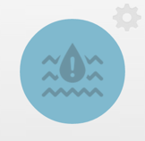
standardTile("water", "device.water", width: 2, height: 2) {
    state "dry", icon:"st.alarm.water.dry", backgroundColor:"#ffffff"
    state "wet", icon:"st.alarm.water.wet", backgroundColor:"#53a7c0"
}
The above tile definition would render as (when wet):
controlTile()
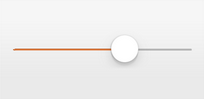
Use a control tile to display a tile that allows the user to input a value within a range. A common use case for a control tile is a light dimmer.
In addition to name and attribute parameters, controlTile() requires a third argument to specify the type of control. The valid arguments are “slider” and “color”.
- name
- Name of this tile.
- attribute
- Attribute that this tile displays
- type
- The type of control. Valid types are “slider” and “color”
controlTile("levelSliderControl", "device.level", "slider",
            height: 1, width: 2) {
    state "level", action:"switch level.setLevel"
}
This renders as:
You can also specify a custom range by using a range parameter. It is a string, and is in the form "(<lower bound>..<upper bound>)"
controlTile("levelSliderControl", "device.level", "slider", height: 1,
             width: 2, inactiveLabel: false, range:"(0..100)") {
    state "level", action:"switch level.setLevel"
}
valueTile()
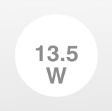
Use a value tile to display a tile that displays a specific value. Typical examples include temperature, humidity, or power values.
valueTile("power", "device.power", decoration: "flat") {
    state "power", label:'${currentValue} W'
}
This renders as:
carouselTile()
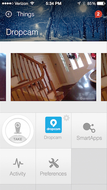
A carousel tile is often used in conjunction with the Image Capture capability, to allow users to scroll through recent pictures.
Many of the camera Device Handlers will make use of the carouselTile().
carouselTile("cameraDetails", "device.image", width: 3, height: 2) { }
multiAttributeTile()
Multi-Attribute Tiles are a new kind of tile that incorporate multiple attributes into one tile. They are meant to combine several different attributes into one 6X4 tile. Here are some of the types of tiles that you can create:
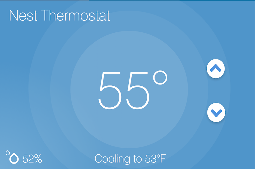
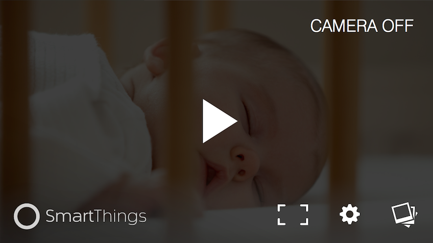
| Lighting | Thermostat | Video Player | Generic (Default) |
|
|
|
|
Multi-Attribute Tiles must have a width of 6 and a height of 4. This means that the tiles block of your Device Handler must use the new 6 X Unlimited grid layout.
tiles(scale: 2) {
  ...
}
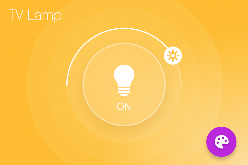
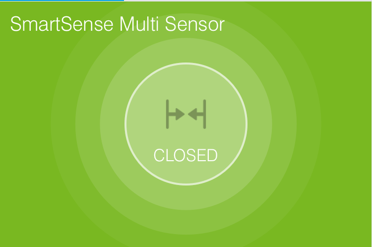
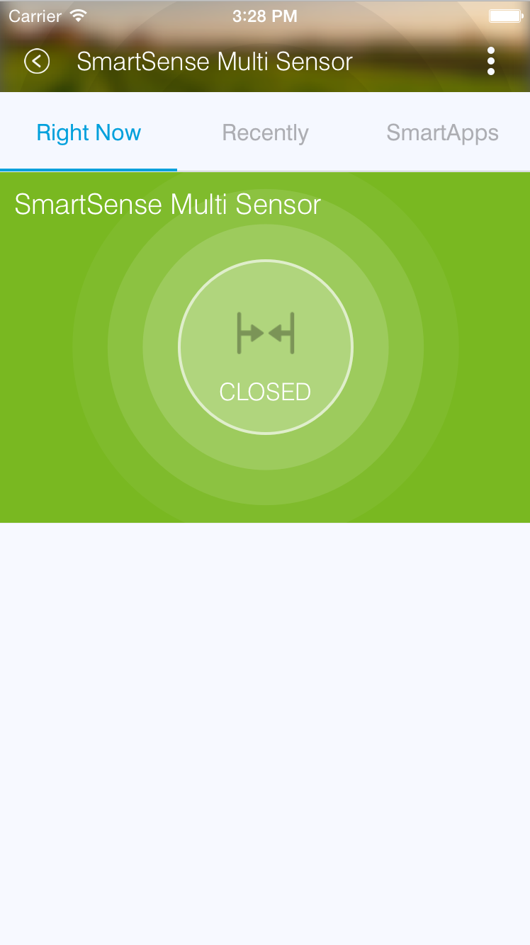
The multiAttributeTile() method works much like any of the other tile methods currently available. Let’s look at an example of a simple generic tile for a contact sensor.
tiles(scale: 2) {
  multiAttributeTile(name:"richcontact", type:"generic", width:6, height:4) {
    tileAttribute("device.contact", key: "PRIMARY_CONTROL") {
      attributeState "open", label: '${name}', icon:"st.contact.contact.open", backgroundColor:"#ffa81e"
      attributeState "closed", label:'${name}', icon:"st.contact.contact.closed", backgroundColor:"#79b821"
    }
  }

  main "richcontact"
  details "richcontact"
}
This code should render a device details page that looks like this:
The multiAttributeTile() method takes the same parameters as any other tile except for the type attribute. Valid options for type are "generic", "lighting", "thermostat", and "video".
Note
The multiAttributeTile() type option are currently a placeholder. The specified type does not change how the tile will appear.
Also worth noting is that you may see other types of tiles in existing Device Handlers. Tiles that are not documented here should be considered experimental, and subject to change.
Multi-Attribute Tiles support a new child method parameter called tileAttribute(). This is where the real power of multi-attribute tiles comes into play. Each tileAttribute() declaration defines an attribute that should be visible on the multi attribute tile. The tileAttribute() method currently supports two parameters:
tileAttribute(attribute, key)
- The
attributeparameter is the device attribute that the tile attribute represents. For example, device.contact or device.level. - the
keyparameter can have the following values:
| Value | Meaning | Example |
|---|---|---|
| PRIMARY_CONTROL | Main control in middle | 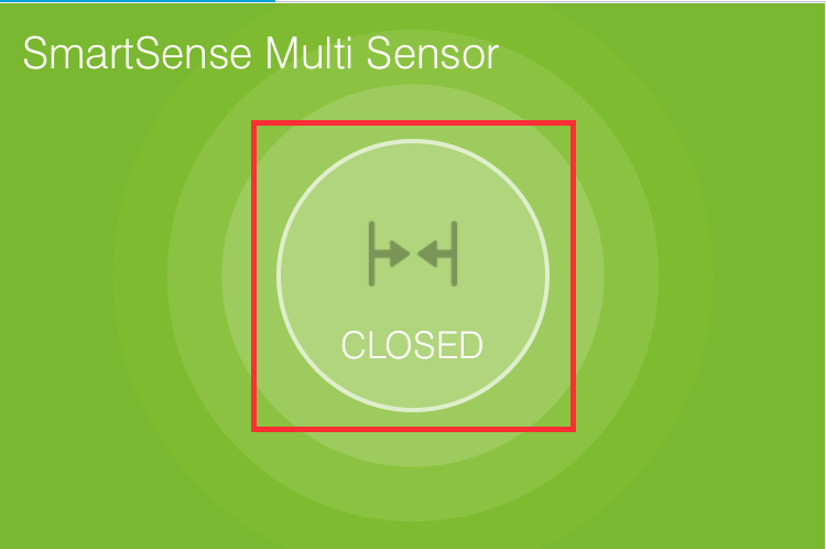
|
| SECONDARY_CONTROL | Textual status message | 
|
| SLIDER_CONTROL | Slider above primary control | 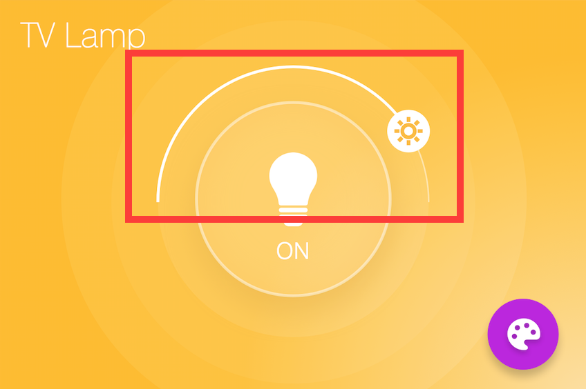
|
| COLOR_CONTROL | Color palette button | 
|
| VALUE_CONTROL | Up and down buttons | 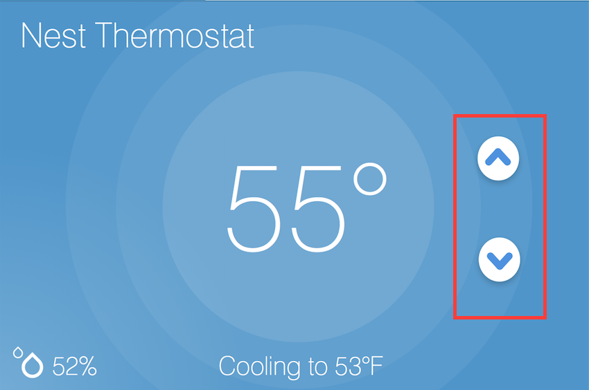
|
Note
The color of the multi-attribute tile is controlled by the PRIMARY_CONTROL tile attribute. It will default to a light gray color. If the PRIMARY_CONTROL attribute contains states that change the color, the color of the multi attribute tile will also change.
The last piece of the puzzle is state. tileAttribute() can support states just like other tile types. This is done with the new method attributeState(). From the contact example above:
tileAttribute("device.contact", key: "PRIMARY_CONTROL") {
  attributeState "open", label: '${name}', icon:"st.contact.contact.open", backgroundColor:"#ffa81e"
  attributeState "closed", label:'${name}', icon:"st.contact.contact.closed", backgroundColor:"#79b821"
}
This will render the main control in the middle (because the key is specified as "PRIMARY_CONTROL", with the label either “open” or “closed”, the appropriate icon, and a yellow color for the open state and green for closed. You can also supply actions just as you would for state(), to trigger actions when tapping on the control. attributeState() is just like state but for tileAttribute().
Tile Layouts
To control which tile shows up on the things screen, use the main method in the tiles closure. The main method also supports a list argument just like the details method. When given a list, the main method will allow the user to choose which tile will be visible on the Things screen. The details method defines an ordered list (will render from left-to-right, top-to-bottom) of tiles to display on the tile details screen.
tiles {
    // tile definitions. Assume tiles named "tileName1"
    // and "tileName2" created here.

    main "tileName1"
    details(["tileName1", "tileName2"])
}
Examples
All Devices define tiles, but here are a few examples (ordered from simpler to more complex) that illustrate using many of the tiles discussed above: